// BRAND IDENTITY + BRAND STRATEGY
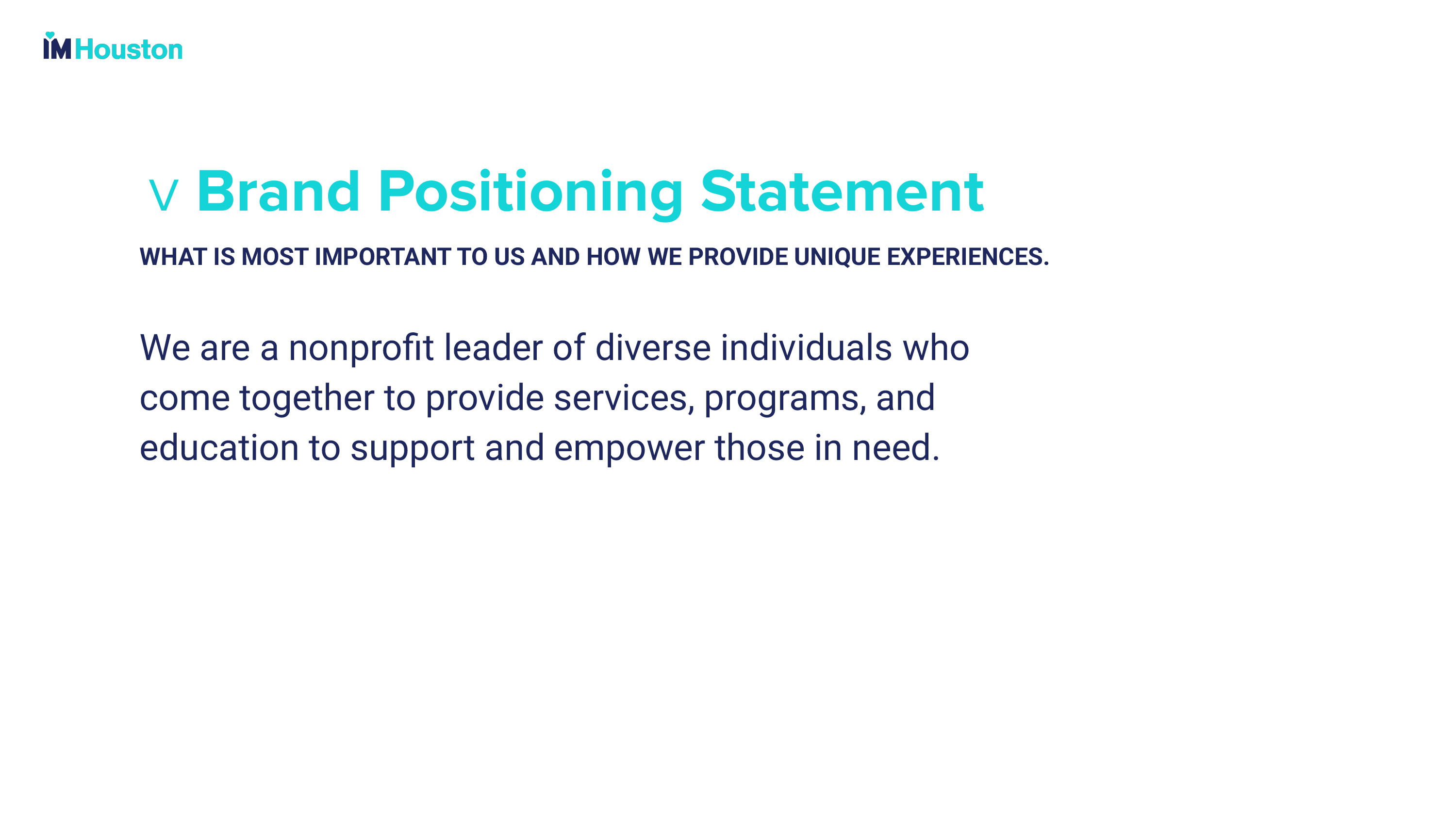
IM Houston, formerly known as Interfaith Ministries for Greater Houston, underwent a transformative rebrand to better reflect its mission and impact in the community. This comprehensive rebrand encompassed a new name, logo, visual identity, messaging strategy all designed to unite diverse individuals under a common purpose of building a stronger Houston through service.
“Michael Vamosy and his team were incredible to work with! We are a nonprofit organization in Houston and are not accustomed to working with agencies like DEFIANT, whose clients include Fortune 500 companies and Hollywood celebrities. They treated us with the utmost care and professionalism, guiding us through a year-long rebrand and brand strategy. They listened to our concerns and were responsive. In the end, they developed a fresh, new look for our organization. Michael even personally flew to Houston to attend our Gala and see our work first hand. It was a great experience!”
Maria Magee / Chief Development Officer, IM Houston
BRAND IDENTITY
// DATA DRIVEN CREATIVE
The Brand Identity centers around a new logo system with a distinctive “IM” emblem, a new core color palette, typography, and iconography that reinforces themes of connection and community service. This cohesive visual language extends beyond the logo, creating a flexible identity system that maintains recognition across all applications while appealing to both current supporters and younger audiences.
// LOGO DESIGN
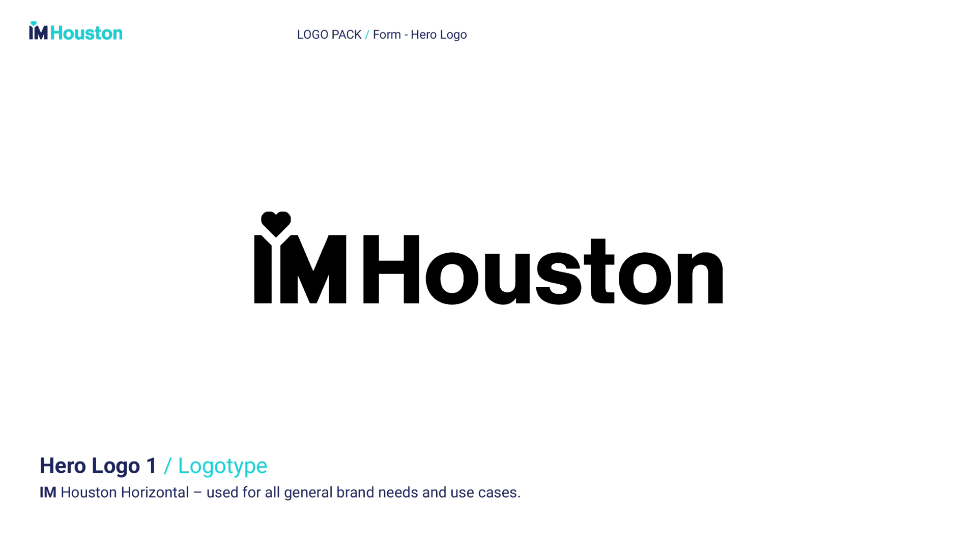
New Name and Logo: “IM Houston” was developed with a bold, modern logo featuring the letters “IM” prominently displayed with a heart cradled in between, replacing the apostrophe. This change maintains a connection to the organization’s history while presenting a more concise and memorable identity. The logo system reinforces the organization’s core philosophy of community transformation — where individual action becomes collective impact.
// TYPOGRAPHY + ICONOGRAPHY
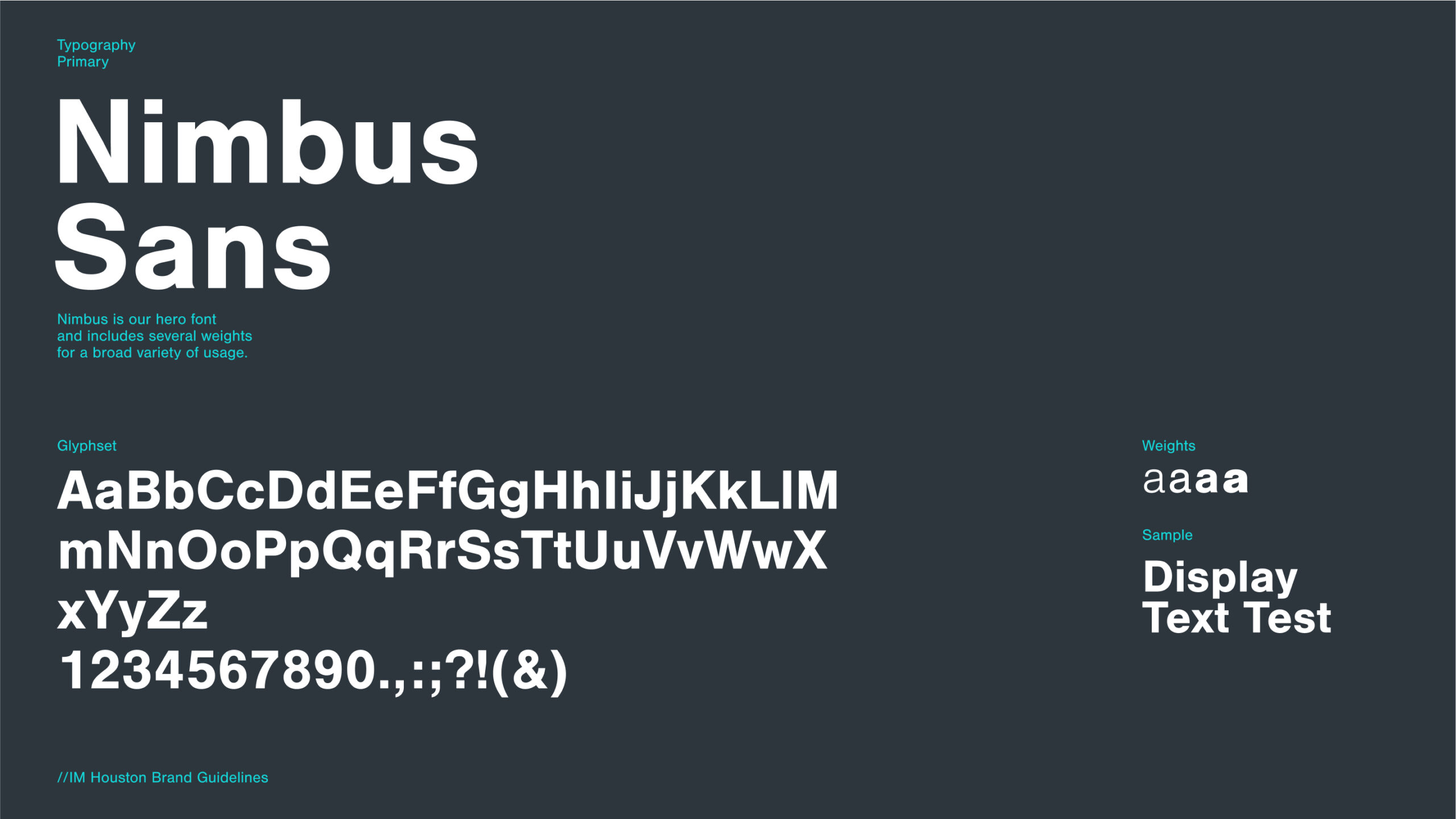
The typographic system centers on Nimbus Sans as the Primary Hero font, selected for its versatility that balances professionalism with approachability. The typeface’s clean geometric forms echo the modular “IM” emblem while providing necessary flexibility across various applications. We also developed a heart-inspired iconography system that subtly reinforces themes of connection and community service. These icons can function as standalone elements, background patterns, and navigational elements, creating a cohesive visual language that extends beyond the logo. Both typography and iconography were designed with scalability in mind, ensuring brand recognition from digital avatars to large-format signage.
// COLOR THEORY
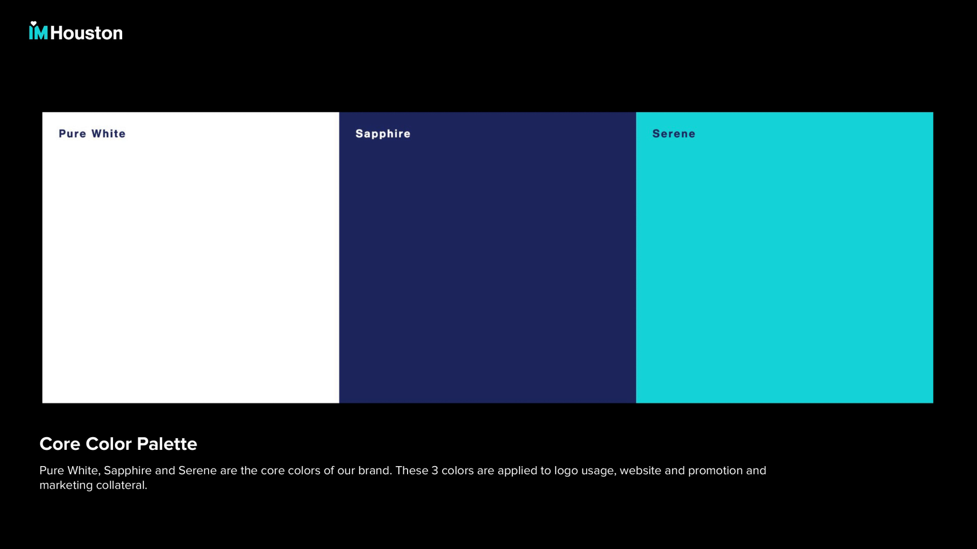
A brand new color palette was created for IM Houston reflecting a sense of energy and trustworthiness. Black and white are always a presence, with a subtle touch of Cool Gray. Our IM Houston Deep Blue hero color has a few shades to help create balance, (Medium Blue and Blue Gray) along with a secondary teal to add energy and the pop of color. Our tertiary Lavender is included for special uses, like presentations, charts or apparel.
BRAND STRATEGY
// DATA DRIVEN STRATEGY
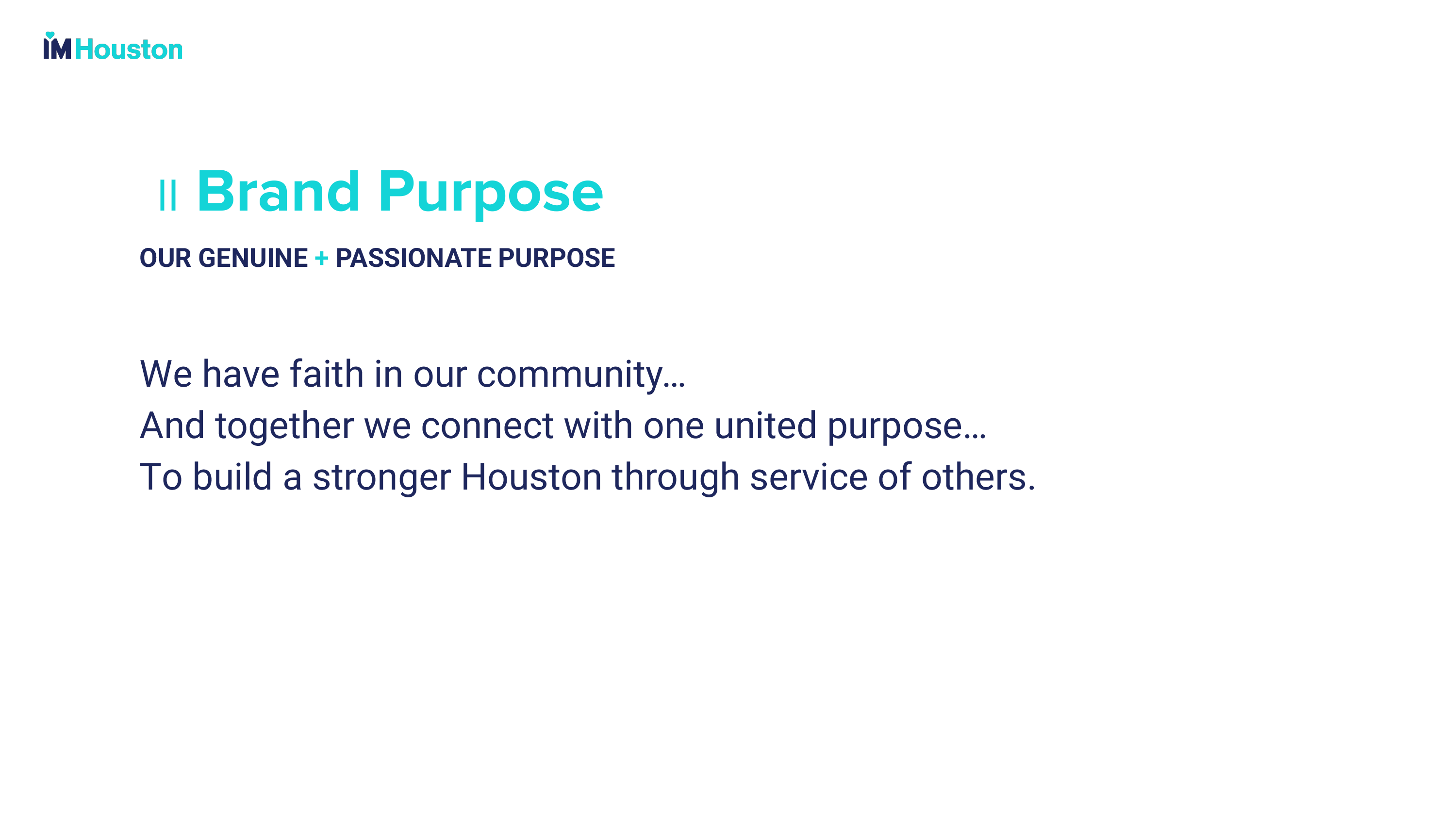
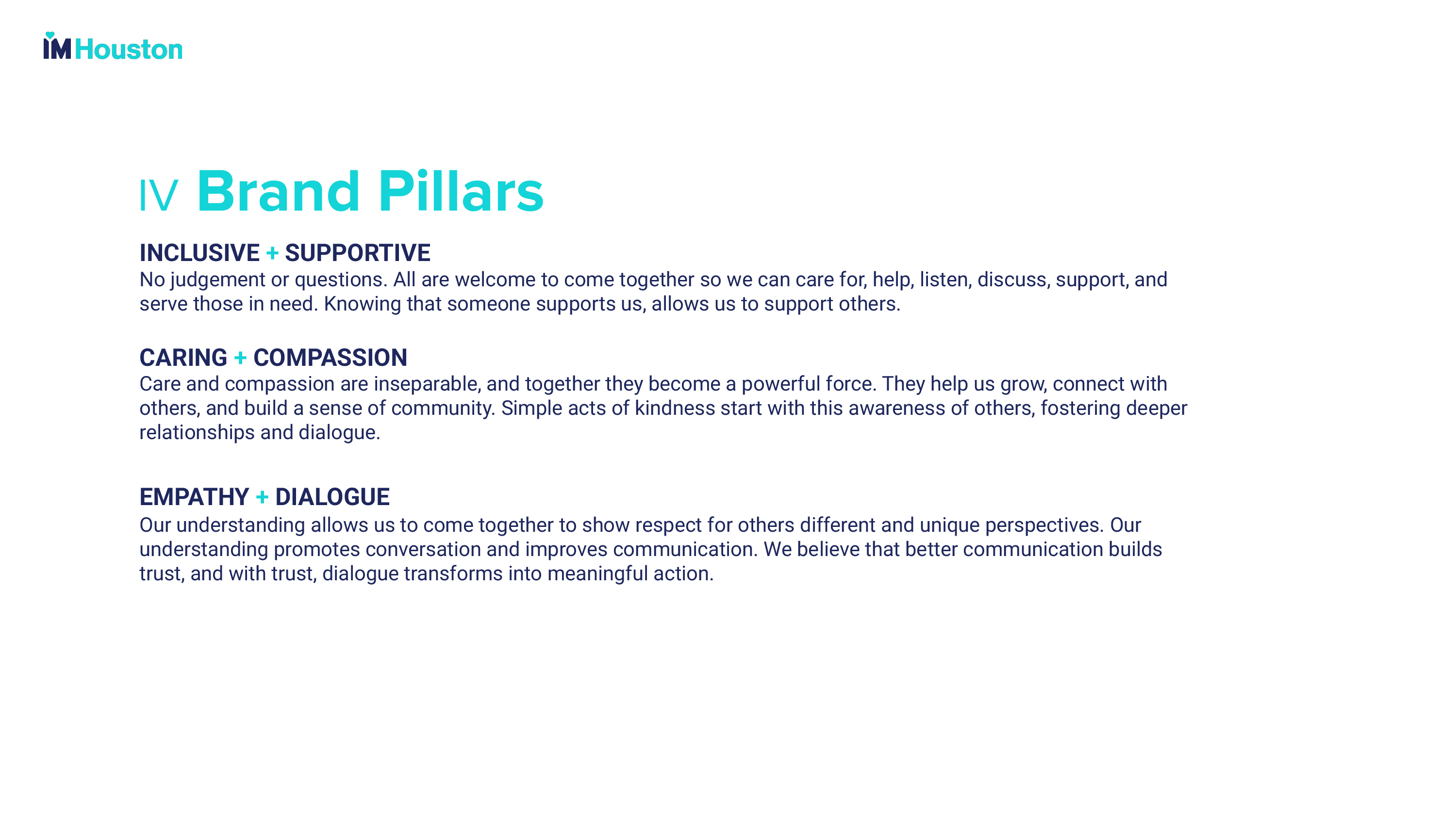
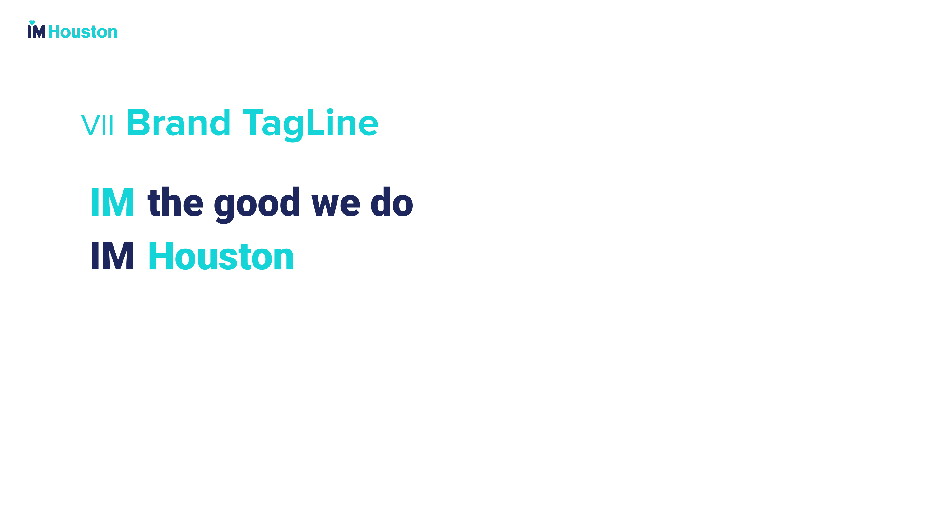
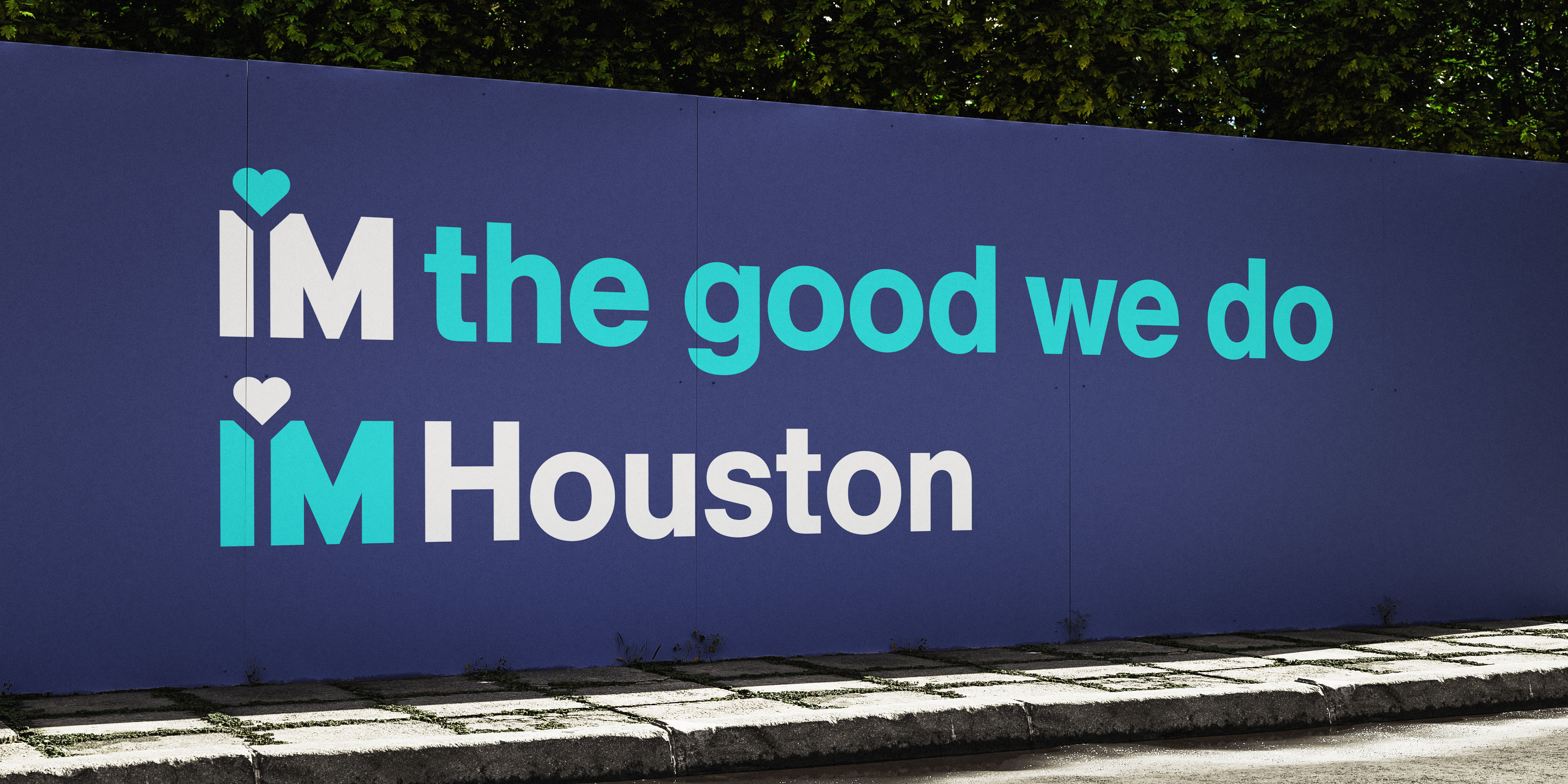
Rooted in the manifesto “IM the good we do,” our strategy bridged legacy trust with youth appeal through data-driven insights. We developed a strategy emphasizing unity, empowerment, and dialogue. Six pillars — Vision + Action, Service + Empowerment, and Inclusive + Supportive, among others — guide messaging to reflect Houston’s diversity. The shift to “IM Houston” helped soften institutional undertones, framing the nonprofit as a community hub rather than a traditional charity.
// IM HOUSTON TRANSITION
To facilitate a smooth transition from Interfaith Ministries for Greater Houston to IM Houston, we created a dynamic transition video that leveraged elements from our graphics toolkit to visually bridge the organization’s legacy with its refreshed identity. The animation employed heart iconography, gradient overlays, and kinetic typography to guide viewers through the evolution, emphasizing continuity of mission while introducing the modernized visual language.
BRAND FILM
// AN EDITORIAL APPROACH
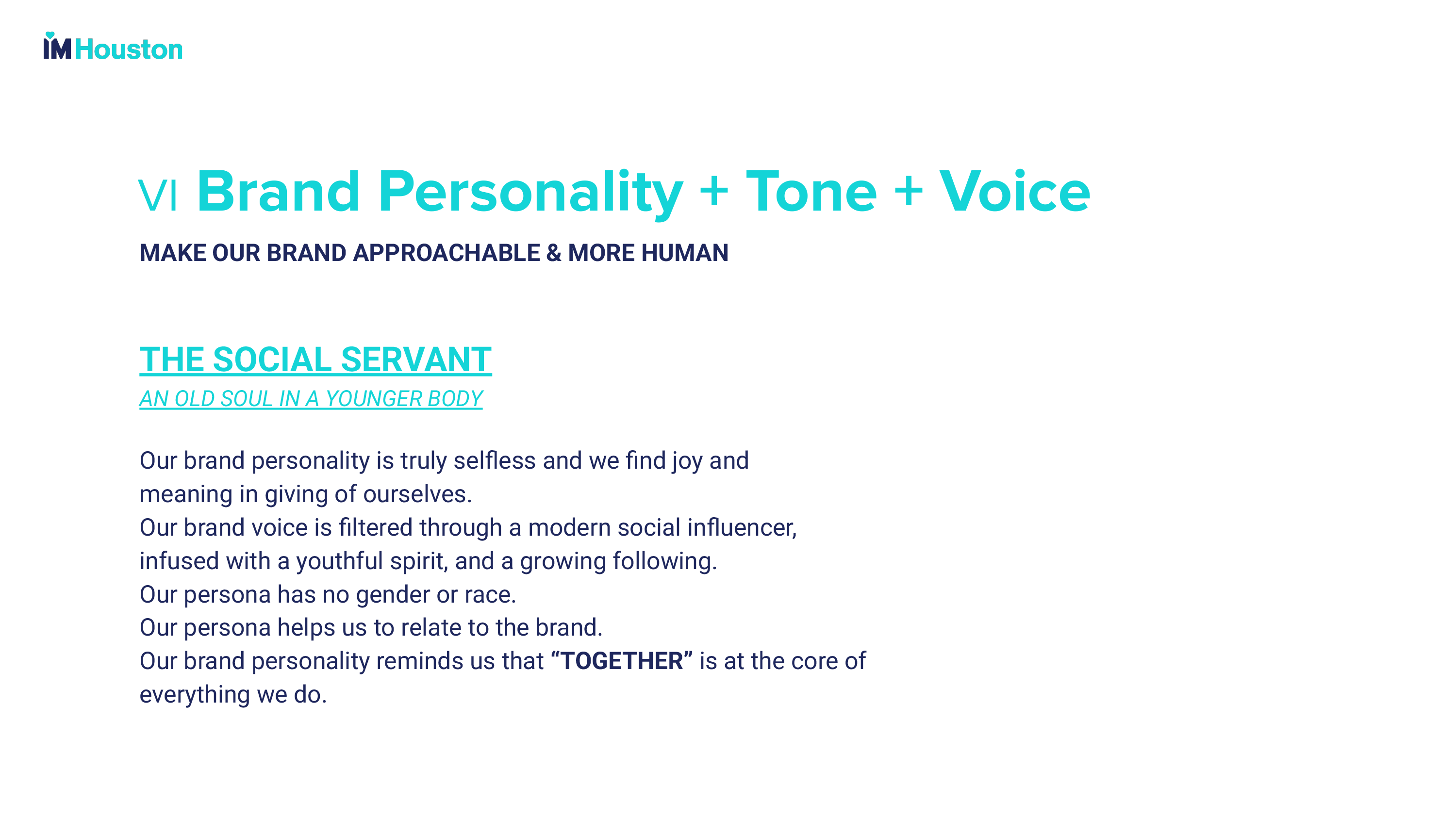
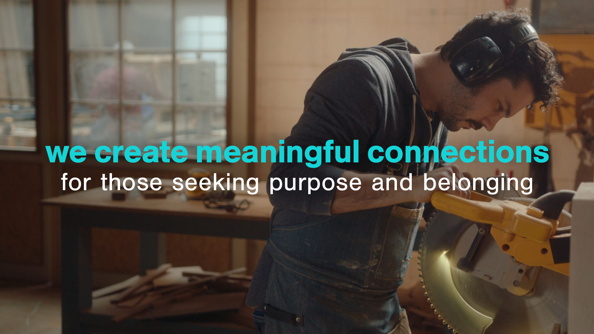
To help increase brand awareness, we wanted to create a powerful storytelling vehicle that would bridge the significant generational gap identified in our market research. The brand film employs a “See & Say” editorial approach that weaves together intimate moments of community impact with Houston’s vibrant landscape, visually unifying the organization’s expanded reach. This storytelling strategy balances institutional credibility with youthful energy, maintaining the brand’s approachable yet trustworthy ethos.
BRAND APPLICATION
// BIG IMPACT
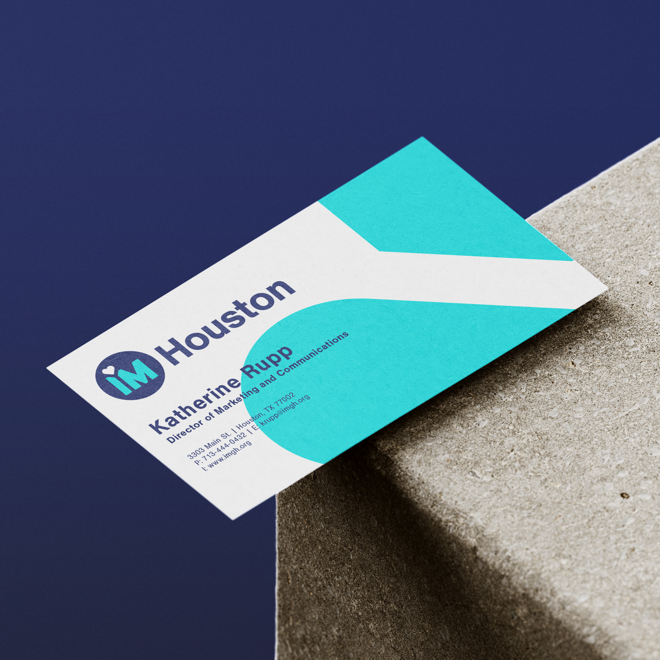
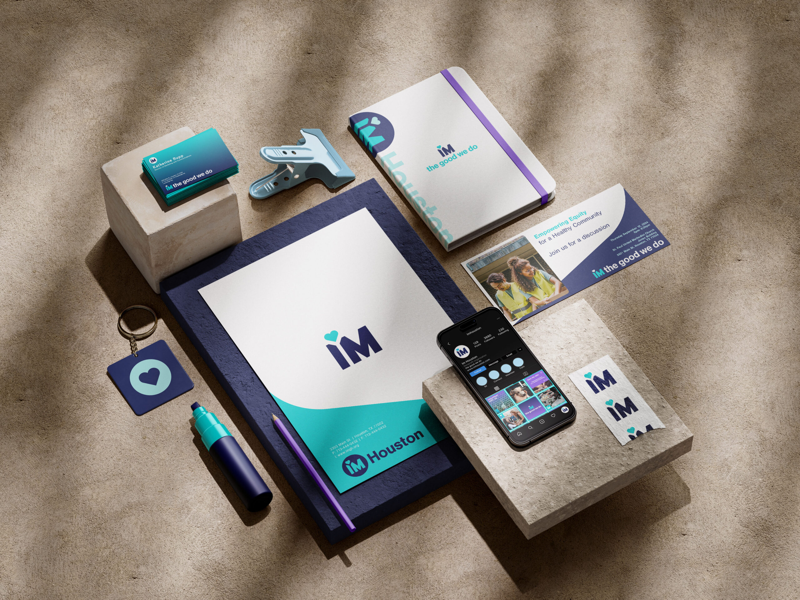
The rebrand’s visual language translates cohesively across civic and digital spaces: the bold colors energize volunteer apparel and high-visibility exterior signage, while clean typography balances professionalism with approachability in stationery and donor communications.
This comprehensive rebrand provides IM Houston with a versatile toolkit and system for consistent communication across various touch points:
- Apparel and merchandise
- Stationery and business collateral
- Social media content and strategy
- Website design
- Exterior signage
“It was a real pleasure working with DEFIANT. They participated in multiple meetings, offered creative proposals, listened to our feedback, and successfully incorporated suggested changes into the final design and brand positioning documents. By the end of the process, DEFIANT had become part of the IM Houston team, knowing our services as well as we did, and providing examples of how we could optimize and implement the new brand materials.”
Henry Florsheim / Board Chair, IM Houston
// SOCIALS
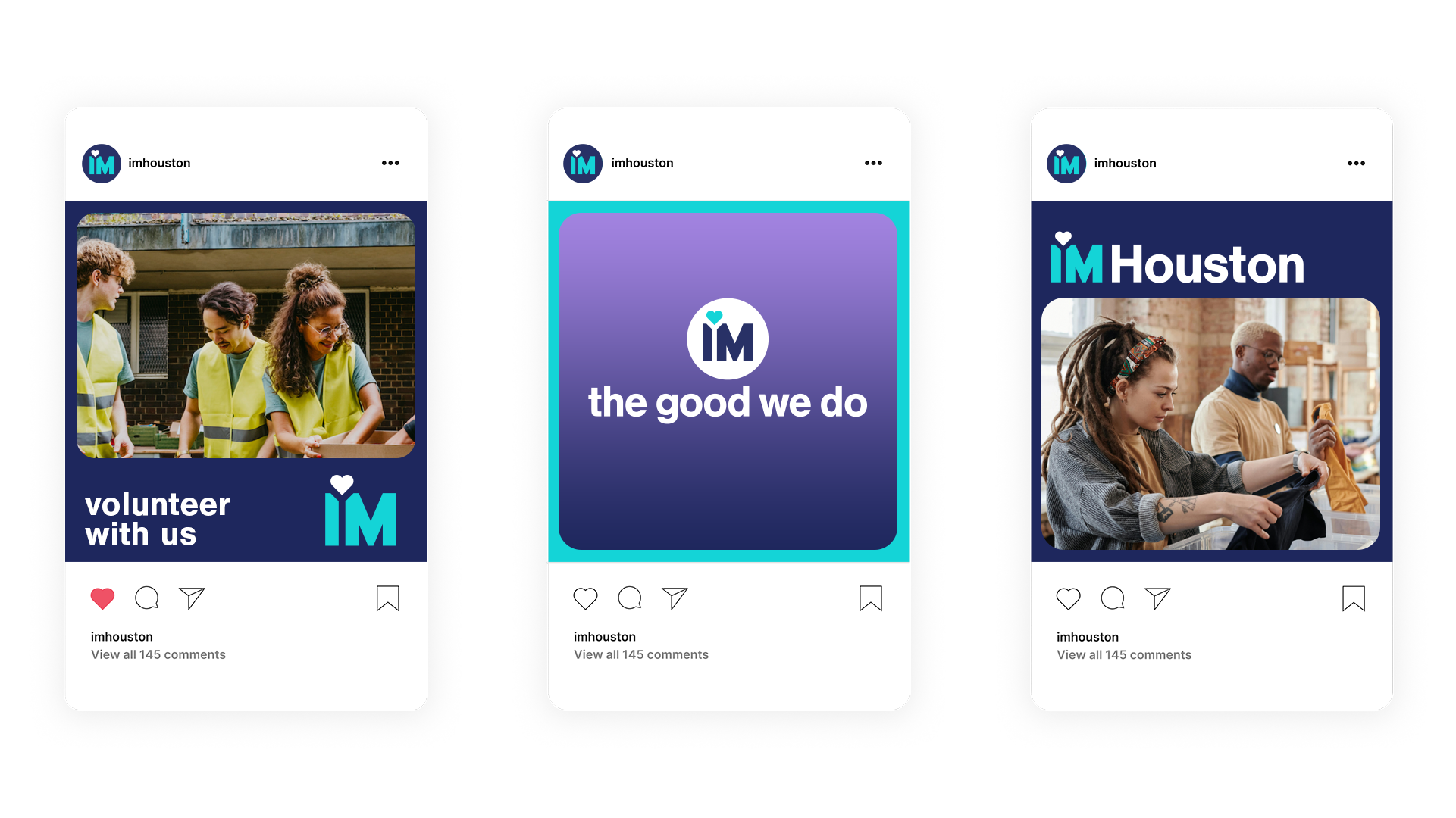
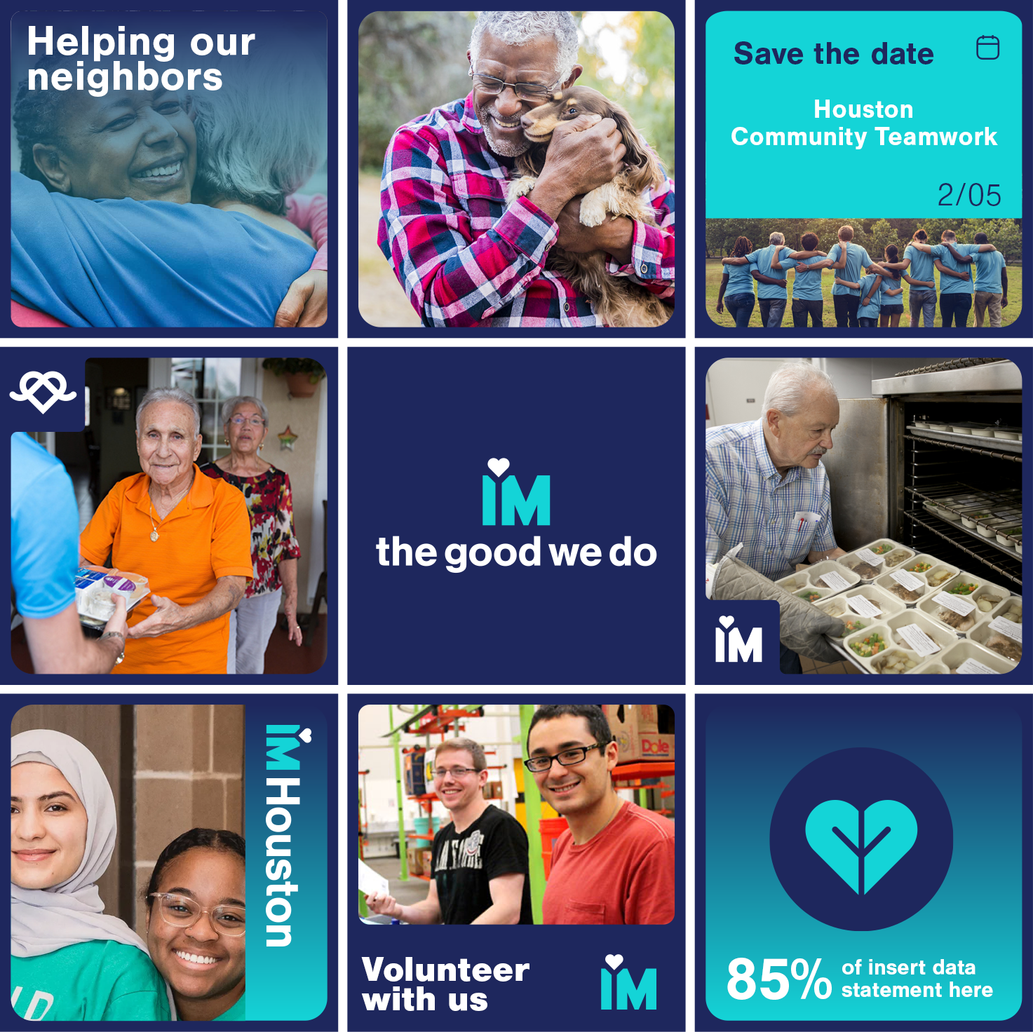
The social media approach amplifies IM Houston’s revitalized identity by blending authentic volunteer storytelling with bold, modular visuals that mirror the geometric logo system. Candid moments of community impact are elevated through dynamic content formats, maintaining the brand’s identity.
// WEBSITE
The website was transformed to emphasize intuitive user journeys through layered visual storytelling, seamlessly connecting the various programs IM Houston has to offer and to donation/volunteer pathways. The website becomes a digital extension of IM Houston’s community-first ethos guiding users from impactful storytelling to clear calls for action while maintaining the manifesto’s focus on meaningful connections and shared purpose.
GRAPHICS TOOLKIT
// PLUG + PLAY
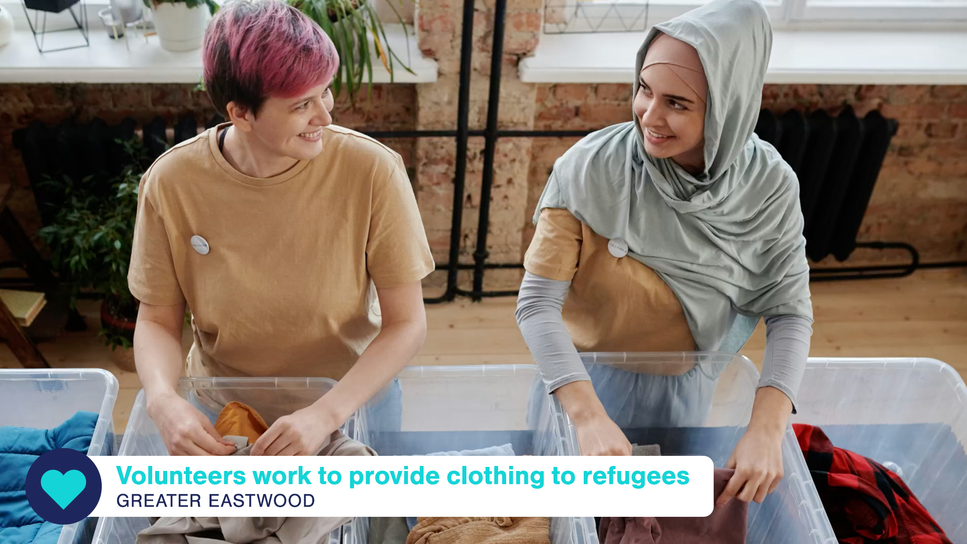
A dynamic suite of “plug-and-play” assets were created to amplify the brand organically. The graphics toolkit includes a modular suite of dynamic assets: Animated logo reveals, type systems, and lower thirds kits provide flexibility for the IM Houston team, allowing them to adapt and expand the brand’s visual identity while maintaining its core essence.


